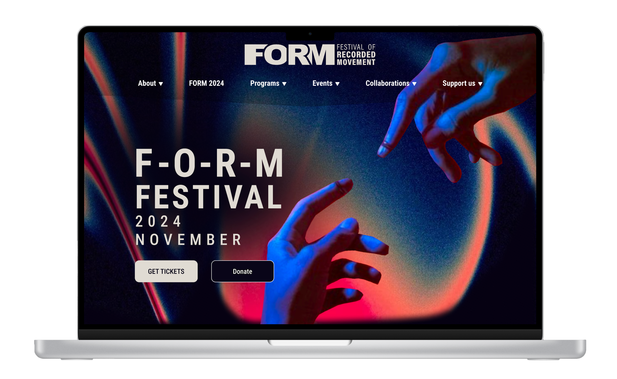
FORM FESTIVAL
My and my team’s main goals are to simplify navigation, make the checkout process smoother, and ensure everyone has a good time using the site. The aim is to create an easy, frustration-free experience for all festival-goers.
About FORM Festival
FORM is a film festival that screens and commissions films that have to do with the body motion.FORM stands as a vibrant intersection where the kinetic beauty of human movement meets the cinematic lens, inviting audiences and creators alike to explore the profound narratives woven through the dance of form and motion.
Team
4 UX Designer
1 Project Manager
My Role
UX Design
UI Design
Tools
Figma
Figma Jam
Timeline
1 week
Discovery
Ideation
Prototype
Design
01/ Discovery
Kick-off Meeting & Brainstorm
In the kick-off meeting,my team and I engaged in a productive brainstorming session where we dissected the client's proposal and crystallized the goals and objectives for the web platform. During this initial gathering, we also delineated roles and responsibilities. This collective effort established a solid groundwork for the project, aligning our approach with the client's vision and setting forth clear targets for success.
Client's Proposal
xxx
02/ Ideation
Site Map
In the ideation phase, I and my team crafted a clear and detailed information architecture to ensure users can navigate the website’s content with ease.
User Stories
The client provided us with 3 user stories to develop:
As a festival-goer, I want to discover films focused on sustainability directly from the Homepage.
As a festival attendee, I want to create an account and log in to access personalized festival content.
As a festival supporter, I want the option to choose between Memberships.
User Flows
xxxxx
Wireframes
03/ Design
We incorporated abstract motion graphics or wave-like patterns that simulate movement. Utilize imagery that captures the essence of dance, motion, and film. Including silhouettes of dancers, abstract representations of human.
MoodBoard
A key priority for this project was to ensure our new design echoed the sensibility and ambiance of the existing webpage. By broadening our moodboard, I and my team delved into a study of other product marketing sites to grasp their content structure, workflow, and layout more deeply.
Style Guide
Type
H1 - Roboto Condensed Bold
H2 - Roboto Condensed Medium
Body Text Emphases - Roboto Condensed Regular
Body Text - Roboto Condensed Regular
Visual Hierarchy
Clear font sizing and weight prioritize crucial information, making navigation intuitive.
Formatting Content
Optimized layout for Mac ensures content fits without overscrolling, offering a seamless experience.


